
What is Swiss Design?
Swiss Design, also called the International Typographic Style, is all about simplicity, order, and clarity. It emerged in Switzerland in the 1950s and quickly became one of the most influential design movements of all time. If you’ve ever seen a clean, grid-based layout with sharp typography and lots of white space, you’ve probably encountered Swiss Design in action.
As UI designers, we have always been drawn to how Swiss Design blends function and form so seamlessly. It’s not just about aesthetics—it’s about making things work effortlessly. The philosophy behind it prioritizes readability, structure, and alignment. The goal? Strip away anything unnecessary and focus only on what truly matters, creating a smooth and intuitive user experience.
What Defines Swiss Design?
Swiss Design is built on a few core principles that make it instantly recognizable:
1. The Grid System
A defining feature of Swiss Design is its strong reliance on grids. These grids bring structure to a design, ensuring that every element aligns perfectly. The result? A clean, organized look that’s easy to navigate.
2. Typography Takes Center Stage
Typography is at the heart of Swiss Design. Sans-serif fonts—especially Helvetica, which was born from this movement—are a staple. The text is always clean, functional, and used with purpose.
3. Asymmetry with Balance
Instead of traditional centered layouts, Swiss Design often embraces asymmetry. This approach adds movement and energy while still maintaining a sense of order.
4. White Space Matters
Swiss Design isn’t about cramming as much information as possible onto a page. Instead, it values breathing room. White space enhances readability and gives designs a polished, high-end feel.
5. Minimalism with Intent
The philosophy of “less is more” is key to Swiss Design. Every element serves a function—there’s no room for unnecessary decoration.
6. Images with Purpose
Swiss Design uses images thoughtfully, often incorporating high-quality or minimalistic visuals that complement the clean layout. Images are aligned with the grid system, ensuring they enhance the design rather than overwhelm it.
Swiss Design in Action: Real-World Examples
Many modern websites embody Swiss Design principles, whether consciously or not. Apple’s website, for example, is a masterclass in grid-based layouts, clean typography, and generous white space. The site feels effortless to navigate, with every element serving a clear function. Another great example is Leica, which follows a similar philosophy of simplicity and functionality. Swiss Design’s influence is also evident in Google’s Material Design, which emphasizes clarity, hierarchy, and space.
How We Used Swiss Design in Our UI
When working on our UI, we didn’t set out to create a strictly Swiss-style design. Instead, we took inspiration from its principles and blended them with our own vision. The result? A modern, minimal, and structured interface—without feeling too rigid or lifeless.
A Grid-Based Structure for Consistency
One of the first things we incorporated was a strong grid system. Our UI is built on a well-defined grid that keeps everything aligned and consistent. Every button, text box, and image follows this structure, making the interface feel intuitive.
Using a grid also makes responsiveness easier. Since everything is neatly placed, adapting the design for different screen sizes is seamless. Whether it’s on a desktop or mobile device, the layout stays balanced and clutter-free.
White Space for Clarity and Focus
We also embraced white space as a design tool. Instead of cramming too much onto the screen, we allowed elements to breathe. This makes the interface look more premium and helps users focus on what matters.
For example, we spaced out buttons to make interactions easier and gave typography enough breathing room for better readability. This approach aligns with Swiss Design’s emphasis on reducing cognitive load.
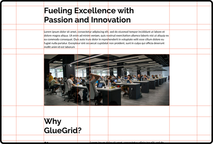
The following image shows the use of whitespace in our design.
Typography Inspired by Swiss Principles
Swiss Design heavily influenced our typography choices. Instead of decorative fonts, we selected clean, sans-serif typefaces to enhance readability. For paragraphs and subtexts, we used Lato, ensuring a smooth and modern feel. For headings and titles, we chose Raleway, which adds a refined and structured look. However, typography in Swiss design is more than just font selection; it’s about hierarchy and visual flow. By varying font weights and sizes, we guide users naturally, making important information stand out without unnecessary styling.
Merging Swiss Design with Our Own Style
While we took inspiration from Swiss Design, we also wanted to adapt it to better suit our design needs. Instead of strictly following its rules, we made adjustments that balance structure with a modern, user-friendly experience. The result is a semi-Swiss minimal design—clear and functional, yet still engaging.
For example:
- We used a grid-based layout to maintain order and consistency across the interface, ensuring a seamless visual hierarchy.
- We embraced white space to create a clean, spacious feel, allowing key content to stand out without overwhelming the user.
- We incorporated large, high-quality images strategically to add visual appeal while keeping the overall layout simple and uncluttered.
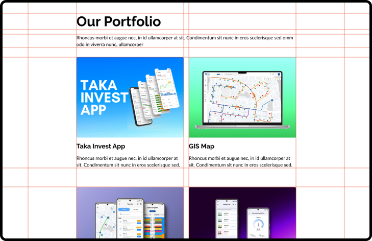
The following image shows how we used the grid system to make uniform spacing everywhere.
Why Swiss Design Works for UI
Swiss Design isn’t just about making things look tidy—it actually improves usability. A strong grid, thoughtful typography, and well-placed white space create an intuitive experience. When users can find what they need without effort, engagement and satisfaction naturally improve.
By incorporating these principles, our UI feels modern, functional, and visually appealing. We didn’t follow Swiss Design to the letter, but we used it as a foundation to create something both unique and familiar.
Conclusion
Swiss Design has remained relevant because it focuses on clarity and functionality. Though it originated in print, its principles translate beautifully into digital design. By adopting its core elements—grids, white space, and clean typography—we created a UI that feels structured yet inviting.
That said, great design isn’t about blindly following rules—it’s about solving problems in the best way possible. Swiss Design gave us a strong foundation, but we made it our own. The result? A balance between timeless structure and fresh, modern creativity.
At the end of the day, the best design is one that feels effortless. And if Swiss Design has taught us anything, it’s that sometimes, simplicity is the most powerful choice.