Designing a great user interface isn’t just about making things look good—it’s about crafting an experience that makes sense. At our UI team, we follow a structured process to ensure that every project we work on meets both business goals and user expectations. From the initial idea to the final prototype, here’s a look at how we transform concepts into a polished, user-friendly design.
Step 1: Gathering Requirements & Understanding the Vision
Every project starts with an idea. Our clients come to us with their requirements, explaining what they want to build. Sometimes, they already have a clear vision, while other times, they rely on us to shape the idea. To make sure we’re on the same page, we ask important questions:
- What is the purpose of this product or feature?
- Who are the primary user personas?
- What problems are we solving for the user?
- What are the must-have functionalities?
- Are there any specific design elements you want to include or avoid?
- Are there any existing solutions or competitors we should consider?
- Do you have a preferred design style or branding guidelines?
Along with this, clients often provide references—websites, apps, or designs they like. If not, we conduct our own research to find relevant examples and inspiration.
Step 2: Researching & Understanding the Users
Once we have an understanding of what the client wants, we dive into research. This step is all about studying similar designs and understanding their strengths and weaknesses. We look at existing systems, analyze their structure, and see how they function.
At the same time, we conduct user research to understand the target audience. Who will be using this product? What are their needs, behaviors, and pain points? This helps us design a solution that is not only visually appealing but also functional and user-friendly. During this phase, we also engage in brainstorming sessions to explore different design possibilities, challenge assumptions, and generate innovative ideas that align with user needs.
We carefully dissect these references, not to imitate but to understand what works well and what doesn’t. Our goal is to take inspiration and apply the best practices to the new project, ensuring that the design is unique and tailored to the client’s needs. Through brainstorming and moodboarding, we refine our approach and make sure our design decisions are on point before moving forward.
Step 3: Structuring the Information – Creating a Sitemap
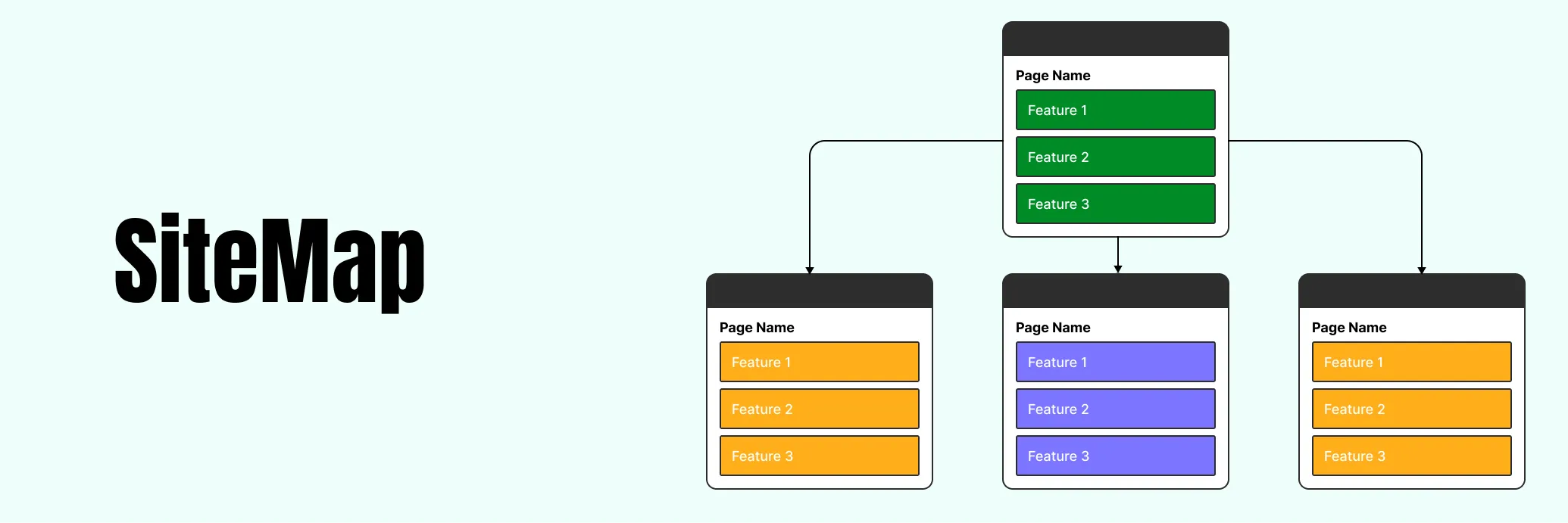
With all our research in place, we start working on the Information Architecture, the backbone of the design. This is where we organize all the features and content into a logical structure. The easiest way to present this is through a sitemap.
A sitemap is a simple, visual representation of how different pages or screens are connected. It helps us and the client understand the flow of the system before we start designing anything.
Once the sitemap is ready, we present it to the client for feedback. They review the features, approve the structure, and define the Minimum Viable Product (MVP), the most essential features that need to be designed first.
Step 4: Wireframing or Low-Fidelity Design
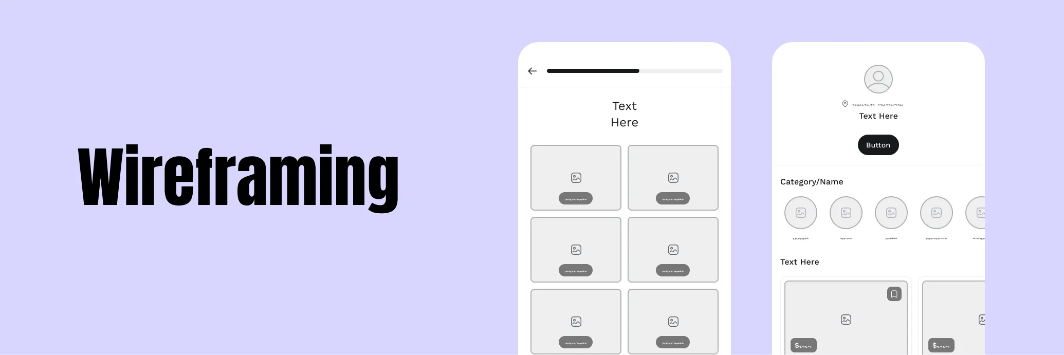
Now that we know what to prioritize, we start sketching the layout. At this stage, we create either a Wireframe or a Low-Fidelity Design, depending on the project. We usually don’t make both—one is enough to map out the structure.
Wireframes are basic, black-and-white layouts that focus on content placement, navigation, and user flow. They don’t include colors or detailed visuals, but they give the client a clear idea of where everything will go—buttons, menus, text fields, and other elements.
After creating the wireframe, we share it with the client for feedback. This step is crucial because it allows for adjustments before we move into more detailed design work.
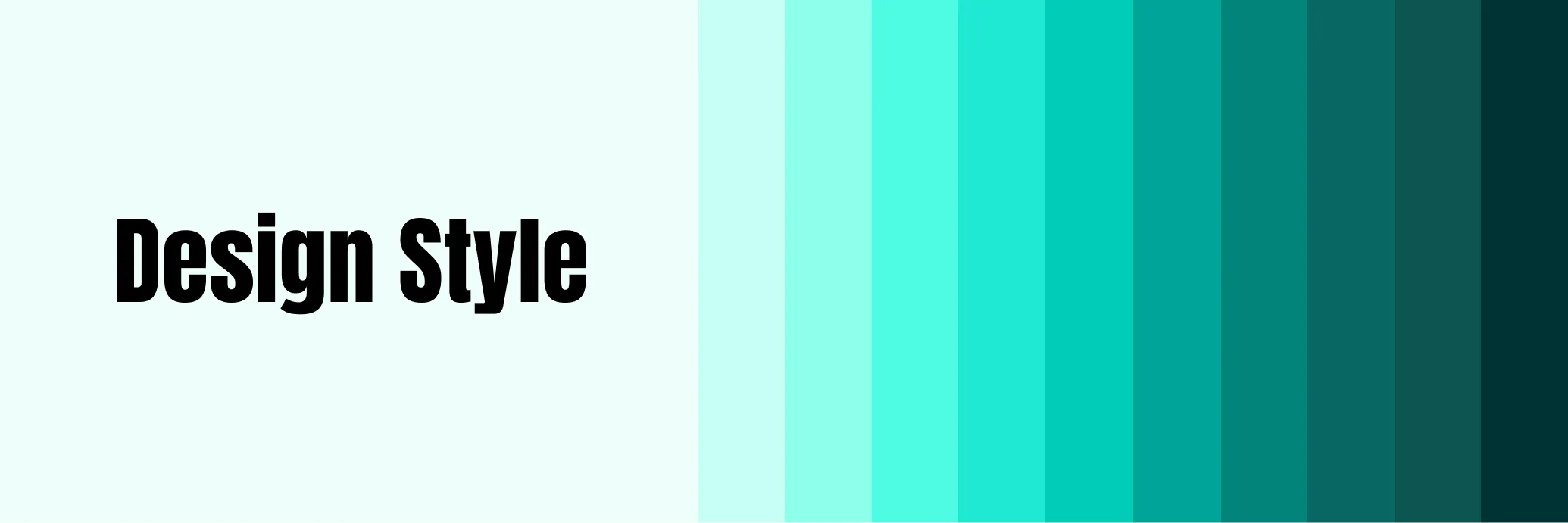
Step 5: Defining the Design Style
With the wireframe approved, the next step is deciding on the visual style. Clients may provide a brand guideline, which includes color palettes, typography, and UI elements that we need to follow. If they don’t have one, they might give us creative freedom to come up with a fresh design style.
Defining the design style at this stage is important because it sets the foundation for the next step, Mid-Fidelity design.
Step 6: Mid-Fidelity Design – Adding More Detail
Now, we bring the wireframe to life with colors, fonts, and design elements, but we still keep things flexible. Mid-fidelity designs are refined versions of wireframes with:
- Defined typography
- Applied color schemes
- Proper layout adjustments
- Basic UI elements like buttons and forms
These designs give the client a realistic preview of how the final product will look. If they want, we can sit down for another round of feedback. While Mid-Fidelity designs are not pixel-perfect, they provide a good balance between structure and visual appeal.
Step 7: The Final Design
Once the Mid-Fidelity designs are approved, we move on to the High-Fidelity Design, or what we call the Final Design. This is the polished version of the UI with:
- High-quality images and icons
- Smooth typography and spacing
- Pixel-perfect layouts
- Interactive components
By this stage, we’ve already addressed most of the client’s feedback, so changes are usually minor. The goal is to ensure that everything is visually consistent and functional before moving to the next step.
Step 8: Prototyping – Bringing the Design to Life
The last stage of our process is Prototyping. We create an interactive version of the design that simulates how users will interact with the product. Prototyping allows clients and stakeholders to experience the product firsthand before development begins.
A good prototype:
- Helps visualize user interactions
- Allows for usability testing
- Provides developers with a clear guide on how elements should function
Once the prototype is ready, we hand it over to the development team, providing all necessary design assets, specifications, and guidelines.

Final Thoughts
Creating a user-friendly design is a structured process that requires research, planning, and refinement. Our approach ensures that every design decision is backed by user insights and business needs. By following this roadmap—from gathering requirements to prototyping—we ensure that our designs not only look great but also function smoothly, giving users the best experience possible.
This is how we take an idea and turn it into a fully designed product, ready to be developed. While every project is unique, this structured approach helps us deliver the best possible UI/UX solutions for our clients.